
Photo: Isaac Smith, Unsplash | https://unsplash.com/@isaacmsmith
Pre-reporting for data journalists

A brief intro to exploratory analysis
In a recent paper, a pair of statisticians took a stab at outlining “the most important statistical ideas of the past 50 years.” Among them: “counterfactual causal inference, bootstrapping and simulation-based inference, overparameterized models and regularization, multilevel models, generic computation algorithms, adaptive decision analysis, robust inference, and exploratory data analysis.” Most of these ideas constitute statistical, mathematical, or computational techniques. But the last one is a little different.
Exploratory data analysis probably doesn’t sound like a statistical innovation in its own right. Even the authors of the paper in question argue that the technique represents “an influential back-to-basics movement.” But I think exploratory, graphical research—effectively, messing around with a variety of visualizations of your data before embarking on any serious hypothesis formulation or data reporting—is one of the keys to unlocking a more creative (and complete!) form of data storytelling.
Exploratory analysis (especially data visualization) is also a lot easier today than it was even a decade ago. The advent of drag-and-drop graphical studios like Tableau and open-source visualization suites like ggplot2 allow for the kind of preliminary investigation of a dataset that just wasn’t possible previously—or at least took a lot longer and required more computational resources (and expertise).
I suspect many data journalists have already integrated some form of exploratory data analysis into their reporting pipelines. (The fact that the activity feels like a natural part of our jobs is a testament to recent advances in its ease of implementation.) But as this project series in part seeks to formalize some of the data reporting pipeline for new data reporters, I’d like to propose we consider exploratory graphical analysis as the ‘pre-reporting’ of data journalism. It’s what you should do before you ever pick up the phone; before you ever write down a hypothesis or construct a statistical model.
Here’s a concrete example:
The other day, a colleague shared a climate article from The Washington Post on Twitter that included the following map:
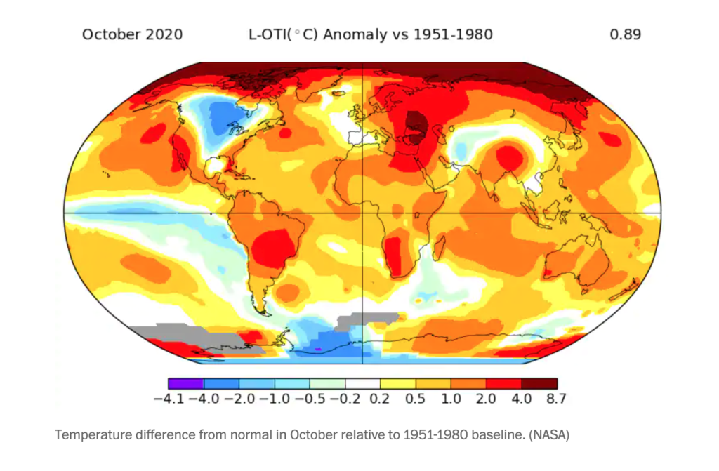
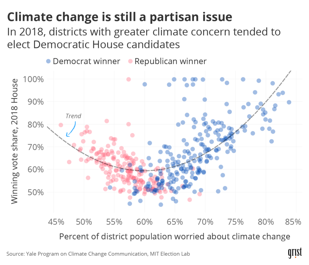
The Post’s article didn’t have anything to do with politics; the map illustrated global temperature deviations (comparing October 2020 to the 1951–1980 average). But as I glanced at the portion of the map occupied by the United States, I noticed that it reminded me of the electoral maps we’ve all been obsessed with over the past few months. If I squinted at it, it seemed like the areas that had experienced temperature deviations in recent decades (positive or negative) were more or less the same areas that had gone for Biden in 2020. There’s plenty of good research out there on the relationship between climate concern and partisan lean—see the chart I made for a recent Grist article below—but I started to wonder if there was any relationship between actual temperature change and voting behavior.
The question was grounds for some exploratory data analysis. Plenty of work has been done on how the experience of climate change shapes belief in climate change—but I wanted to know if not having experienced climate change might predict climate denial (and given the coupling between climate denial and party affiliation, partisan lean). So: to Tableau!
First, I slapped together a county-level dataset containing:
- Temperature deviations over the same time period covered by the WaPo map
- Variables on climate opinion (from the Yale Program on Climate Change Communication)
- Election returns from 2016
And then I started poking around. Let’s take a peek at the core correlation we’re interested in exploring here:
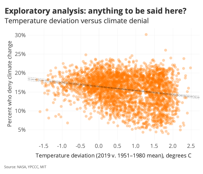
It doesn’t look like there’s a lot of variance explained by the regression, but that best-fit line does indeed have a non-zero slope—and it slopes in the direction we might expect if there were any merit to the climate change / climate belief association we’re interested in interrogating. To get a better sense of the effect here, let’s bin the temperature values:
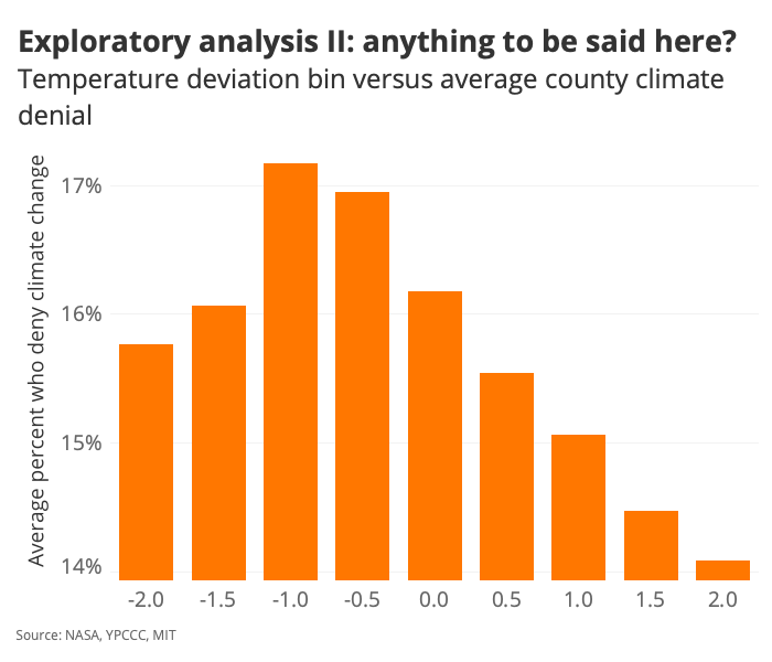
And just for the heck of it, if we take the absolute value of temperature…
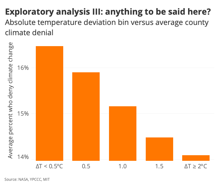
Right. So here we have an interesting chart that basically says: “On average, counties that have experienced a temperature anomaly of greater than 2 degrees Celsius are home to populations who are less likely to deny climate change—by about 2 percentage points.” Let’s see how that observation maps onto voting behavior:
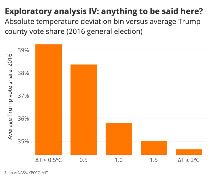
We’re starting to confirm some initial hunches.
And that’s probably where the pre-reporting stops!
It seems like there’s room to ask a few questions here—questions of some experts who study this kind of stuff and questions of the dataset (via the construction of multivariate models, for example). Plenty of confounding variables out there are probably muddying what we’re looking at, and we’ll want to correct for the effects of those variables before drawing any serious conclusions. (We’re not poking at causality or anything; we’re just observing some relationships that might be worth a deeper dive.) But with some exploratory analysis in hand, we can write up a proper pitch and see if we can get an editor to bite.
What do you do before reporting a story? You can get in touch with Clayton Aldern at caldern@grist.org on Twitter @compatibilism.
Comments