
Tracking inclusionary zoning developments with Flourish

We helped Atlanta Civic Circle create a map that incorporates multiple points of information for readers
I recently spent time working with Atlanta Civic Circle to create a map tracking developments that have inclusionary zoning units in Atlanta. The goal was to create a map showing the three inclusionary zoning districts as well as plot the specific locations of the developments.
Map making is such a unique sector of data visualization that comes with its own tools and challenges. As a journalist trying to explore mapping more, I have found Flourish to be one of the most intuitive platforms for mapping — especially in smaller newsrooms.
What is inclusionary zoning?
On Jan. 29, the first inclusionary zoning ordinances were passed in Atlanta. In brief, the ordinance’s purpose is to promote affordable housing by requiring a portion of new construction to be affordable housing for low or moderate income people Developers of residential rental development that have at least ten dwelling units have to set aside either 10% of units at below 60% AMI, 15% of units at below 80% AMI or pay a one-time in-lieu fee. More information about inclusionary zoning in Atlanta and definitions can be found at the city of Atlanta’s website.
The map we built of inclusionary zoning allows the Atlanta Civic Circle and their readers to track developments to date and how many units are being set aside as affordable.
The map shows readers where inclusionary zoning developments are actually located.
Flourish helped streamline this project in a variety of ways, here are my tips for making maps in Flourish:
Finding and uploading geographical data
Finding geographical data can be difficult or very easy depending on the organization or city you are looking at for data. For this project, I first looked for the data with the three inclusionary zoning overlay districts. The city of Atlanta has a lot of accessible files available on an open data hub, so it wasn’t too difficult. We did have to reach out to someone because only two of the three overlays were included on a map. So when in doubt, contact the organization you want data from.
For the actual data points on the map, we requested data from the city of Atlanta Office of Housing and Community Development that included projects up to the present day. The data included addresses, but Flourish requires latitude and longitude to plot the points. Since the dataset was small at only 35 rows, I was able to find each location’s coordinates using Google maps and enter that myself.
Another helpful tool is mapshaper.org. This website allows you to convert data to a variety of formats. You can convert shapefiles, GeoJSON, topoJSON, DBF and CSV files. Flourish requires a CSV, TSV, Excel, JSON, or GeoJSON file, so this website is useful if the data comes in a format like a shapefile.
Choosing and customizing a map
Flourish not only offers a variety of data visualizations, but also many options for maps. These include projection maps, 3D maps and marker maps.
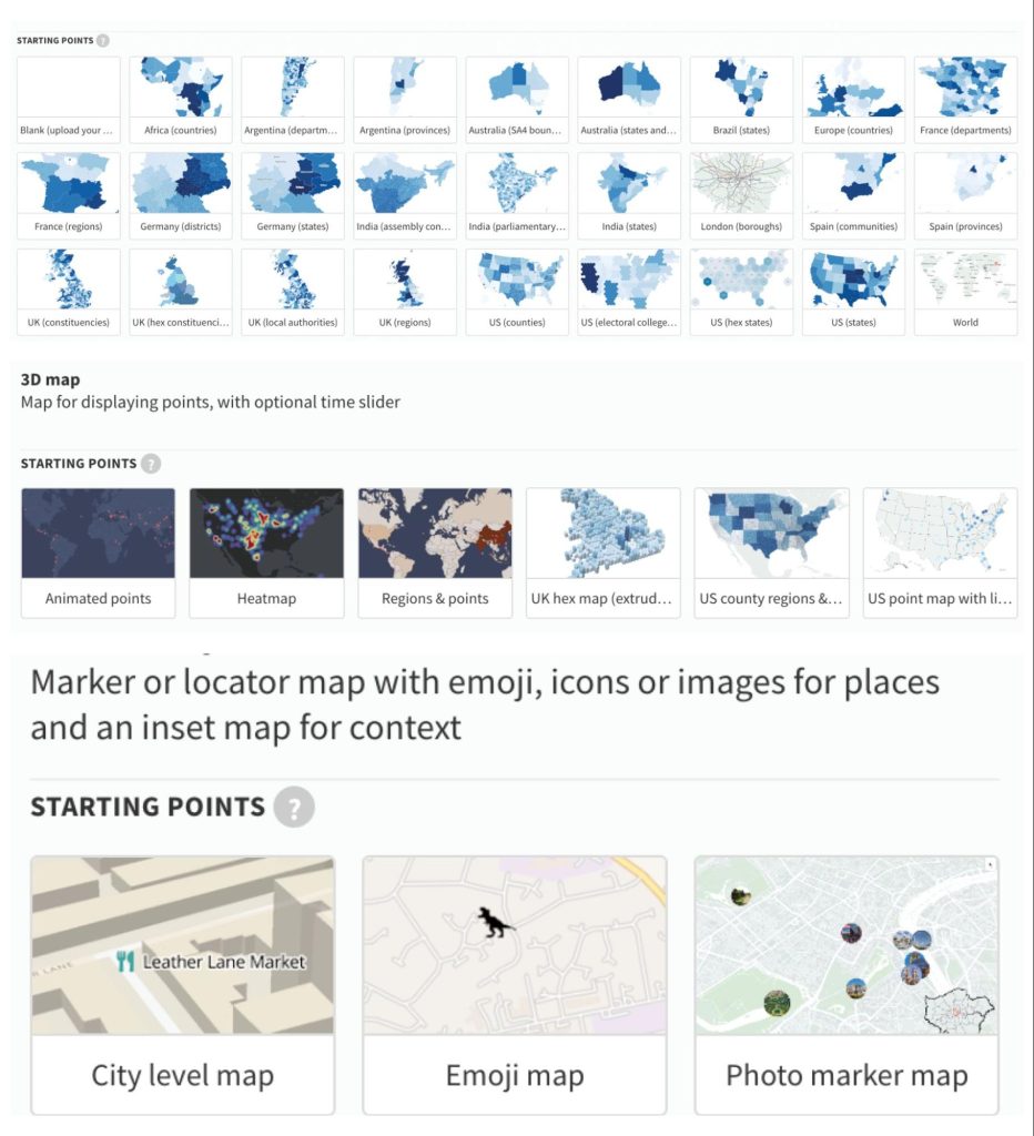
For the inclusionary zoning development map, I used a 3D map template. This template has many other functions that I didn’t use but may be useful for other projects, like an animated time slider that changes the points on the map as time passes.
Whatever your project may be, look at the example and templates provided to see what best fits your data. One thing I do when choosing a template is look at what sample data is included in the template and if I have similar data. The Flourish map template we picked for the inclusionary zoning map used two datasets, which was perfect for our project.
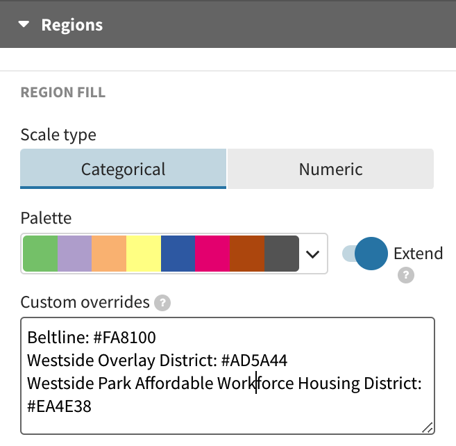
After choosing a map template, it’s time to customize and style your map. This can include changing the map background and editing the colors used on your map. To change the map background, Flourish has several preset options for a vector base map. Just choose a map style, font and labels you want to show up in the background.
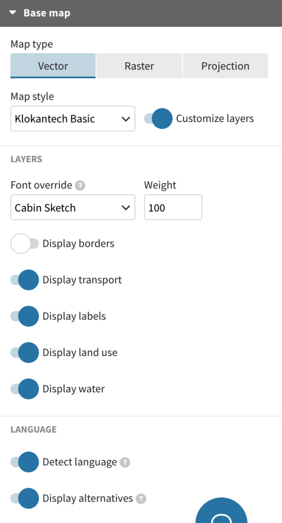
In Flourish, you will have to change colors in multiple places. For example, I changed the point color in the points category and region color in the region category.
There are many tools online like the Adobe color wheel to choose a color palette that follows a color scheme and is accessible. You can use the hex codes to paste into the color options in Flourish.
Sometimes Flourish color options change depending on the part of the map you are editing. In this map template, the color options for regions only allow you to select preset colors. Instead, I used the custom overrides box to add the hex codes.
Accessibility
Flourish also has the great option to add alt text to your visualizations. Alt text is for people who use screen readers as well as providing the text that shows if someone is experiencing low internet connection and media takes longer to load.
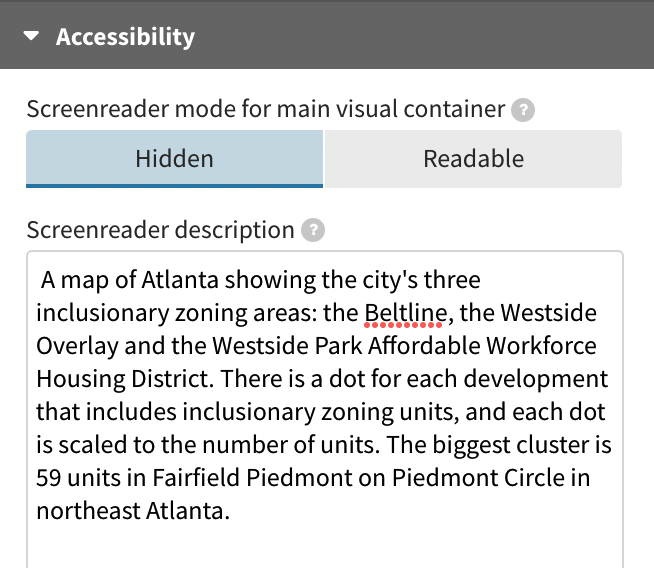
In Flourish, text in the header and footer is read with a screen reader, so don’t repeat it. Describe the data visualization and note key trends or highlights so your readers can get the information they need to understand the visual — even when they can’t see it.
Comments